
A professional websitewith room for the whole business.
A multi-disciplinary business needs to give visitors more than an impressive hero. The archived Thomas & Hutton website screenshot shows how a company introduction, markets, services and news can share one understandable experience.
The work,up close.
This studio-archive website screenshot combines a wide community-focused photographic opening, a company introduction, market and service navigation, and a current-news area. The visual system uses restrained typography and green accents against neutral backgrounds.
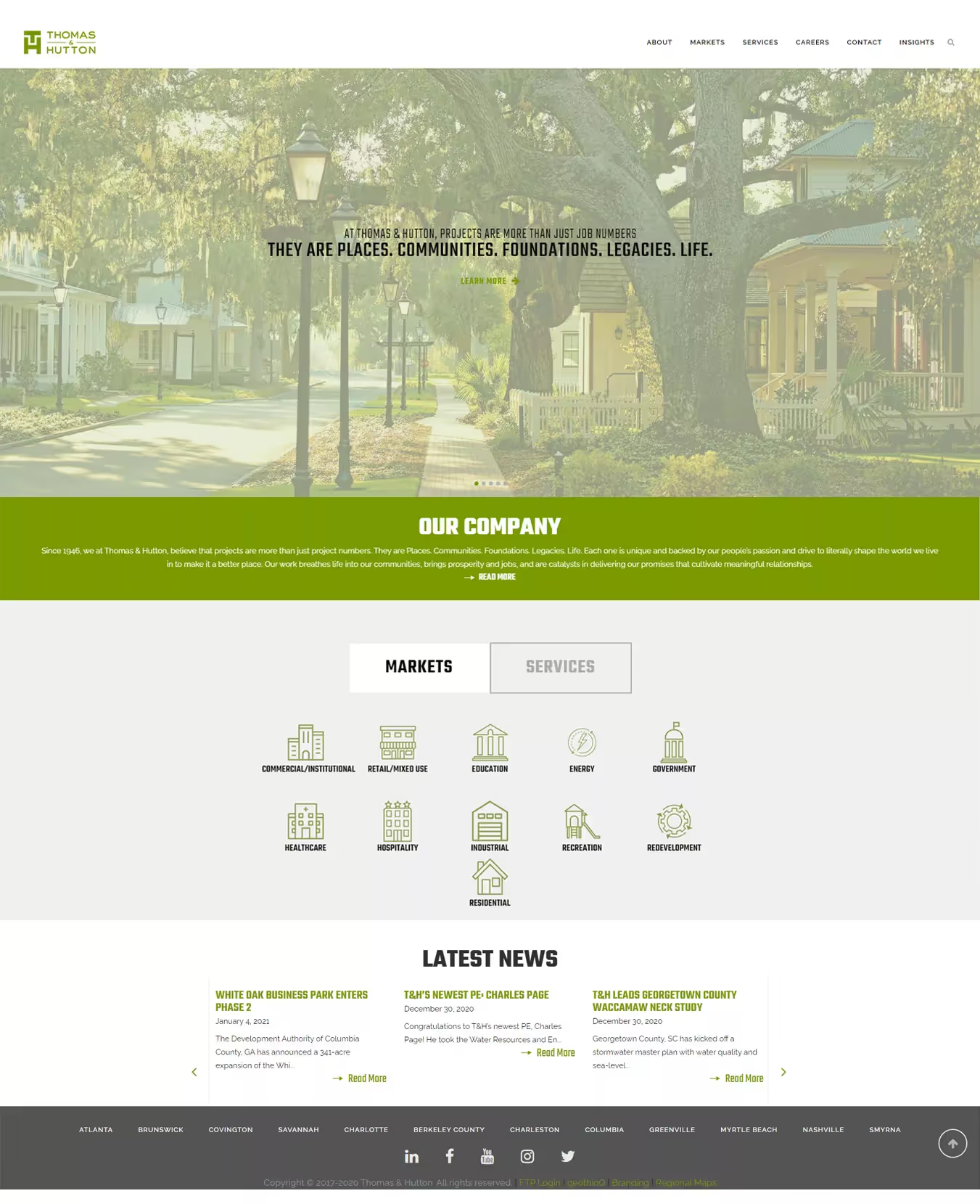
Archived Thomas & Hutton website design with its company, services and news presentation.
THE PROJECT STORY
Make a complex company easier to explore.
The opening image gives the site a clear point of view: community and place are central themes. That first impression is followed by practical navigation rather than an oversized promotional pitch.
The page organizes information into recognizable parts. A company overview explains the organization, distinct Markets and Services controls separate two ways of exploring the business, and a news section gives returning visitors another reason to engage.
That hierarchy is particularly useful for professional-service firms with multiple practice areas. A prospect can arrive for a specific capability while another visitor wants to know the people and organization behind the work.
Design decisions visible in the archive.
The screenshot supports observations about visual hierarchy and content organization. It does not establish traffic, rankings or conversion changes.
Start with place and purpose.
A large tree-lined community image communicates a sense of built environments and local context before technical service details appear.
Separate markets from services.
Distinguishing these navigation concepts offers more than one meaningful entry point for visitors whose needs differ.
Give news an editorial role.
The Latest News area gives the company a place to publish relevant updates rather than relying entirely on evergreen marketing statements.
THE TAKEAWAY
Professional websites need both narrative and navigation.
A good corporate page can convey what a company stands for without making it harder to find its capabilities. The recorded screenshot gives a concrete example of photography, typography, industry navigation and editorial content working as one layout.
Only the historical design visible in the supplied screenshot is documented here. The archive does not establish the project's launch date, authorship breakdown, backend implementation, accessibility testing or performance results.
Evidence note. The source is an archived full-page website screenshot supplied in the studio's Portfolio Items folder. It should not be treated as the organization's current design.
Explore the servicesbehind work like this.
Every business has a different brief. These are related capabilities, not an assertion that every service was provided in this project.